Thursday, 31 October 2013

ORGANISATION/DRAFTING

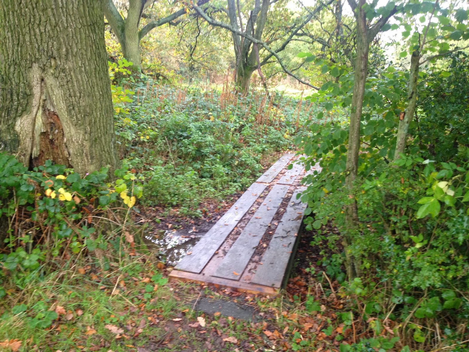
My horror trailer is going to be filmed both outside and in the house. I have taken photographs of the areas outside that I would possibly shoot a scene. 


I liked this as I thought the long path looked quite mysterious and the overgrowth of plants and trees portrayed a sense of being 'trapped'. I could have someone running down this path being scared or perhaps the evil character walking towards the camera.
This is another path that I thought could be quite creepy, again because it gives the 'trapped' effect but also because its a path that turns so anything could be around the corner. 
This is something I'm not certain I will use however it is something that could possibly be used for a horror effect. Perhaps the possessed child could be sitting on it. 
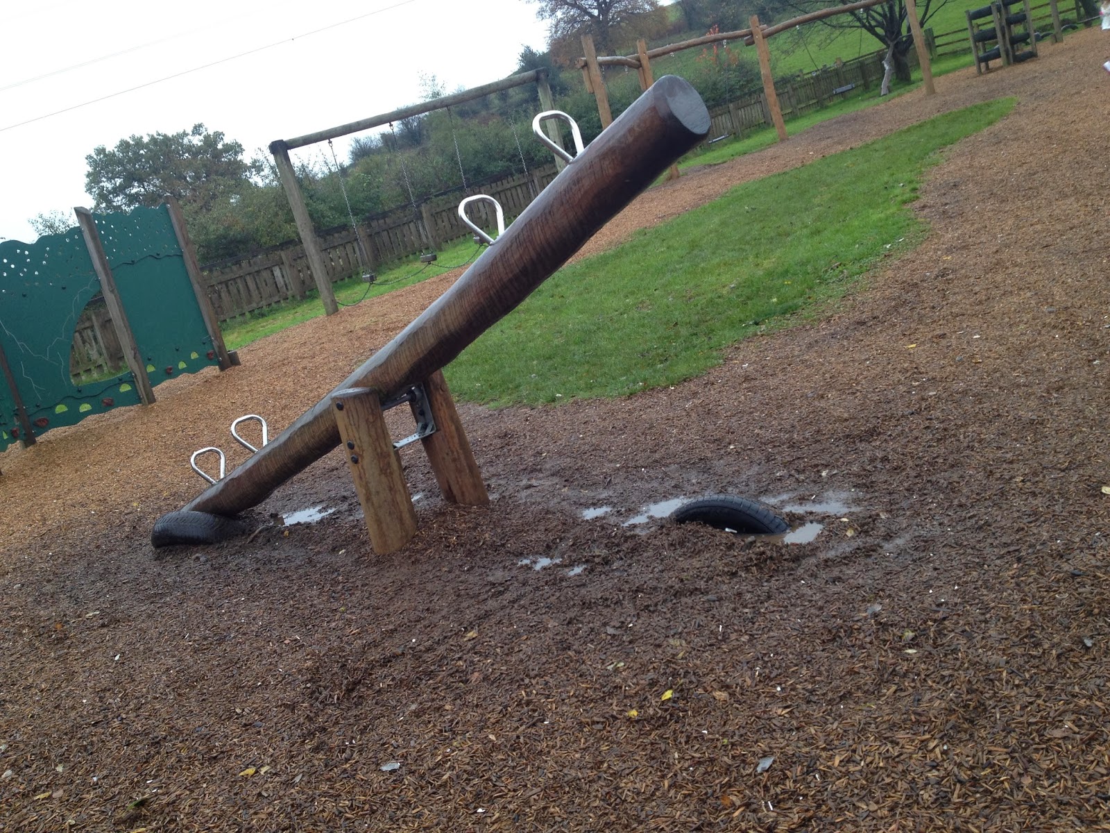
Similar to the photo of the bench I'm not sure I will use this in my trailer but it's another option I have to use. Someone could falls down the side of it when running away or it could be used for a scene whereby the children are happy, before the possession occurs. 


I have mentioned that I would like the children to be at the park at one point in my trailer in my drafting of my movie frames. http://clairewalsh1234.blogspot.co.uk/2013/10/blog-post_9.htmlWhen seeing this in the park I thought it looked quite dark and gloomy therefore could be used in my trailer.

Similar to the 'see-saw' photo, I took a picture of this as an element the children could be playing on. I prefer this more as the chains on the swing look scary and the background of the leafless trees have a horror effect. 
This is a photograph of the area around; the tree branch in the middle could be a possible prop used as it looks quite dominating and unusual - dominating and unusual are two aspects that would scare the audience as its something having power over them and something they are not familiar with. 


I started to think about where characters could be so got my little sister to stand in this place as an example. I thought it would be a good idea to have the father in all black standing here as it looks scary. I did three shots of this to show different length views. 


DRAFTING/PLANNING


After analyzing some horror posters I thought I'd try out some backgrounds on word as a starting point. 


This was the effect I started with; I got the idea of it being brown off the analysis I did of the 'Wrong Turn' poster http://clairewalsh1234.blogspot.co.uk/2013/10/blog-post_27.html , the 'crack' effect I used was also inspired by a poster I analysed - http://clairewalsh1234.blogspot.co.uk/2013/10/research-into-similar-products-shutter.html 
I wouldn't use this as a background because I feel its too strong and would take the spotlight, however I thought it was a good starting point. 

I thought this effect looked like fire, which can be deemed as quite scary - it could also convey my movie as 'life threatening'. This has the potential to be the background of my movie poster as it gives me room to put what I want on to it. Although, I don't think it would suite what my movie is about. 


I changed the contrast of my last one and ended up with this; it also gives the illusion of fire however its more like fire is trying to break though. I thought this effect was quite scary however similar to the first one would dominate the poster. 


This effect is very different to my previous ones; it does not seem as scary as the other ones however I feel it is a good background as it does not dominate however fills in blank spaces. The broken effect in this could represent the fact my family in my horror movie are broken - it could be a very subtle implicit message. 

Sunday, 27 October 2013

SIMILAR PRODUCTS

This is the only other text on the poster aside from the movie title. The fact there is no ‘catchphrase’ or some type of text to add to the poster shows that the actors/actresses in this movie are known. Known actors/actresses will encourage some of the public to go see the movie if they are fans of the actors etc. so putting the names in big at the top of the page is a quiet way of advertising the film.


This woman looks scared /worried; this is a stereotypical facial emotion for a character to have in a horror movie and it portrays to the public that whatever happens to her is very concerning. In contrast, the woman is not crying or hurt which portrays a tough side to her; this shows her as a non-stereotypical woman and would intrigue the audience as it’s not the ‘norm’. The woman is also ‘eye-candy’ for viewers therefore encouraging them to watch it.

The image entails a ‘sepia’ effect; the effect is quite dark and almost fire like with the orange/ brown colour used. Both darkness and fire relate to horror.


This face completes the poster; although the colour, the dark forest and the woman’s facial expression connote to danger/horror, it does not portray an exciting, nerve wrecking horror, whereas this face gives the scary element to it that it needs. Having only half of the face helps to not give away too much of the character so the viewers don’t end up being almost ‘comfortable’ with the face they’re going to see. The half face effect also conveys a sense of mystery and  not being in the know; the character is almost hidden in the shadows which could foreshadow what he will be like in the movie – hidden however could jump out at you at any moment.


The colour is a light red which amplifies the title as it is against a dark background. The title has been placed in a way that makes the letters look out of place and wonky; this could relate to the word ‘wrong’ but could also be representing the messiness of this movie and how it isn't your usual film. 


Thursday, 24 October 2013

SIMILAR PRODUCTS


Film Title; Shutter
Genre; Horror/Psychological Thriller
Director; Masayuki Ochiai
Plot; Ben Shaw and his new bride, Jane, leave New York for Tokyo, Japan, where Ben has a job as a photographer. While traveling, Jane hits a girl in the middle of the wilderness; after regaining consciousness, they find there was no body and think the victim is alright. The victim later starts to appear in Bens photographs and haunts them.


The font used for this text is the accustomed ‘Times New Roman’; to use this for a horror poster could be portrayed as a brave move due to the face it is a common, formal and rather bromidic font type. However, the poster manages to pull it off and it suites the poster itself; any writing has been put in capitals which makes it noticeable and stops it from being dismissed. In addition to this I feel the little flicks at the end of the letters help the font to look quite scary; or perhaps because the poster is so dramatic, having normal writing stops it from going over the top so it starts to look tacky.
The words ‘The Grudge’ and ‘The Ring’ have been made larger compared to the rest of the text because they are the important parts. A lot of people have seen either both or one of those movies, and as those movies got good viewing it automatically puts a good view on this movie.


I really like this image on the movie poster; the face of the evil spirit and frames from the movie have been blended together which does two things for the viewer – Firstly, it shows the evil character and some of the characters which may encourage the public to watch it. Secondly, it very slightly gives away the plot due to the fact the frames from the movie are put there like a collage of pictures in the evil spirits face, showing photography, the people in the pictures and the evil spirit all link somehow.
The colours for the background, the eyes and the mouth are very dark which connote to your stereotypical horror poster. White is then used as an overall effect on the pictures on the face; white is usually seen as ‘pure’ and ‘holy’ however using it on the evil spirit conveys it as more scary than innocent – in addition to this it could be suggesting this evil spirit isn’t all that bad.


‘The most terrifying images are the ones that are real’ This text is referring to the fact the man takes real life photographs and sees a spirit in them which helps to get across the story by having this along with the image. However this text is also almost implying that the images included in this film are real which would not only scare the audience but intrigue them as to what actually happens in this movie; it adds a sense of trust.
‘Shutter’ This is the movie title; it is bigger than any other text on the page so the public know that is the title and pay attention to it. The ‘S’ and the ‘R’ are bigger than the rest of the letters, which could perhaps be portraying a sense of ‘being trapped’ as if they go one side the ‘S’ is blocking the way and the ‘R’ is blocking the other way. There is a light coloured circle in the middle of it, almost like a spotlight – this could link with the ‘being trapped’ theory as it/s as though there is no way out and you’re being targeted with a spotlight. In addition to this the circle could be representing the camera lens or light off the camera in the movie, which would again be giving away some of the story/mise-en-scene used.

Sunday, 20 October 2013

RESEARCH INTO TARGET AUDIENCE

These are the answers to my Questionnaire I uploaded to my blog recently http://clairewalsh1234.blogspot.co.uk/2013/10/sound-effects.html

1


2) What would you expect to see in a horror trailer?
- Violence
- Blood
- Dangerous Items
- Dark rooms

3) What would you like to see in a horror trailer?
- Something unusual
- Faces that would scare me
- A lot of action

4)  What noises usually scare you in horror movies?
 - Screaming
- Unusual noises
- Extremely loud noises
- Whispers
- Footsteps
- Singing

5) What type of camera angles do you think should be included?
- Low angles
- Close Ups
- Extreme Close up
- Extreme Long shot

6) How would you want a trailer to end?
- In the middle of action
- With the 'monster'
- One that leaves us guessing

Doing this questionnaire has helped me to know what I need to include in my trailer and what type of trailer I will do. 

Wednesday, 16 October 2013

ORGANISATION/PLANNING/POTENTIAL TARGET AUDIENCE

I have decided I am going to create a questionnaire in order to make sure I am including what my target audience would want; this will give me ideas for my plot, and what I include in my trailer.
I am asking 30 people from ages 15+, the questions I have thought of including are:

What type of horror movie attracts you most?

Thriller/Action-Adventure horror

Psychological horror/Suspense

Paranormal horror

Torture horror


What would you expect to see in a horror trailer? (This will help me to know what to definitely put in the trailer.

What would you like to see in a horror trailer? (This gives the audience an input therefore giving them what they want)

What noises usually scare you in horror movies?

What type of camera angles do you think should be included? (A sheet of camera angles will be shown to them if they do not know them)

How would you want a trailer to end?

Monday, 14 October 2013

RESEARCH INTO POTENTIAL TARGET AUDIENCE


I decided in my drafting and planning of my storyline that I want my movie to be a 15; http://clairewalsh1234.blogspot.co.uk/2013/09/blog-post_25.html
I also stated that I needed to do research into what I could include in a 15 as I do not want to include elements of an 18 certificate in my trailer. To find out what I can include I went onto the BBFC website http://www.bbfc.co.uk/ and went onto the 15 certificate page
http://www.bbfc.co.uk/what-classification/15
This page gave me loads of information on what is included in 15 certificate movies; overall I realised that strong language, sexual themes etc. can be included however it starts to become an 18 when the language or sexual themes become quite strong

''Occasionally there may be uses of the strongest terms (eg 'c***'), although continued or aggressive use will not normally be passed 15''

''Yes, at 15 violence may be strong. It should not dwell on the infliction of pain or injury, however, and the strongest gory images are unlikely to be acceptable.
Strong sadistic or sexualised violence is also unlikely to be acceptable''

This is a question I paid attention too as it relates to my work;

''What about horror works?''

''Many horror films are rated 15. At 15 there can be strong threat and menace (as long as it is not sadistic or sexualised), although the strongest gory images are unlikely to be acceptable.''